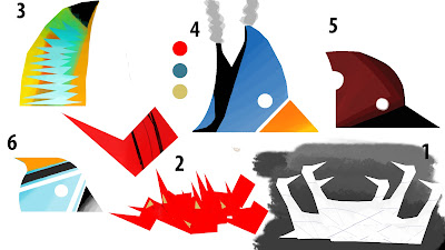
After a meeting with Phil we discussed where I was going with my sketch book thumbnails, we decided that I was straying too far away from my original artist' (Charley Harper) idea's and work ethics and decided that the best idea was to reassess my work process and focus on digital thumbnails instead using the marquee and lasso tools, to better capture his style. Also rather than focusing on having a chaotic city where the true designs of the buildings could only be seen from a specific angle, that the buildings should be pleasing to look at from all angles but still resemble an intended form from a given perspective.
I tried to capture a sort of modern take on 50's suburban house design with bright colours. Also with more complicated shapes that capture many objects in one form of colour as this was a method of Harper's, but soon dropped this idea and settled for a more simple one.
There are concepts for taller, more noticeable buildings for the city, like the real world Gherkin or Shard. My personal favourite is Number 9.
(Note. For Number 7 I tried to make the head feathers look like an antenna array, with satellite dishes and red light's for plane warning.


I was very drawn to these latest thumbnails - more so to the 'less' bird versions - so 3 and 6 - they 'say' bird, but they're not birds.
ReplyDelete