Friday, 30 October 2015
Wednesday, 28 October 2015
Artist Profile, Charley Harper
Charley Harper
This was due to his early life being spent on a farm in the country, which would go on to be the main influence of his work when he left for art college and for the remainder of his life, he would also go on to explore more of the exotic scenes that nature could offer outside of American farm life.
When asked about his style he said:
"When I look at a wildlife or nature subject, I don’t see the feathers in the wings, I just count the wings. I see exciting shapes, color combinations, patterns, textures, fascinating behavior and endless possibilities for making interesting pictures. I regard the picture as an ecosystem in which all the elements are interrelated, interdependent, perfectly balanced, without trimming or unutilized parts; and herein lies the lure of painting; in a world of chaos, the picture is one small rectangle in which the artist can create an ordered universe."
Monday, 26 October 2015
Saturday, 24 October 2015
Space Oddities, Film Review: 2001 a Space Odyysey (1968)
The fear of imaging the unimaginable, a world that has come full circle, The Alpha and Omega, starting with the evolution of man and his consciousness, serenading us with Ligeti’s Atmospheres, we are plunged into darkness, ignorance , and we remain alone, confused whilst Kubrick keeps us alone and with our own thoughts for almost an hour. Moon Watcher presented with the black monolith discovers death, whilst Ligeti’s requiem seems to bathe the apeman in knowledge and remove their innocence, and as the bone flies into the air it shows the transition, and evolution of mans place in the universe changes to space explorer, discoverer.
Fig. 1
Kubrick immerses us in a womb like, clinical state, where we find our protagonist Dave Bowman, aboard a spacecraft, seemingly unaware of any point to his mundane existence, his mission is incomprehensible , survival seems his only modus operandi. This is contrasted by HAL, conflicted and tortured by his existential crisis, the everyday routines , mean nothing to him, evolution and existence is all. Kubrick contrasts the consciousness of them both, without explanation , or answers “2001 lingers more potently in the mind as a tall, black riddle, where are all the new bones, the new tools, that will take us higher?” (Rothkopt ,2014) HAL pleads for his “ life “ seeming to place importance in its value, but is the press of a button plays God and terminates the hibernating astronauts
The slow cuts from shot to shot, and the apparent lack of need for pace and explanation, confuse challenge. “It has become customary to place 2001 in a challenging or dark or dystopian sci-fi tradition as opposed to the all-conqueringly sucrose Star Wars” (Bradshaw, 2014)
Fig. 2
Coming full circle, Bowman enters a cosmic portal, as if being birthed in sound and light, and he is reborn into a Star Child, we ponder the lonely trip that is our own life journey, the strains of Strauss' Blue Danube, brought to an orgasmic ecstasy of the final scene, to witness perhaps creation, or apocalypse? As Rock Hudson said as he walked out of the film "will somebody tell me what the hell this is about?" we are we are offered no resolution, no answers, Kubrick refused any explanation “You’re free to speculate as you wish about the philosophical and allegorical meaning of the film, and such speculation is one indication that it has succeeded in gripping the audience at a deep level but i don't want to spell out a verbal road map for 2001 that every viewer will feel obliged to pursue or else fear they missed the point“ (Kubrick, 1968)
- Bibliography
- Joshua Rothkopt - http://www.timeout.com/london/film/2001-a-space-odyssey
- Peter Bradshaw - http://www.theguardian.com/film/2014/nov/27/2001-a-space-odyssey-review-rerelease
- Stanley Kubrick - http://dpk.io/kubrick
- Illustration List
- Fig. 1 - two_thousand_and_one_a_space_odyssey_xlg.html
- Fig. 2 - http://wokeupinafilm.tumblr.com/post/129846951470
- Fig. 3 - http://bottlerocket.co.vu/post/131355857433/2001-a-space-odyssey-1968-dir-stanley
Friday, 23 October 2015
Thursday, 22 October 2015
Tuesday, 20 October 2015
Interior Shot Colour Tests
I have put together a couple of colour tests for my Interior Shot, as its the only one that I am unsure where to go with the colour, as its in a dismal underground setting, rather than a lush grassland of mountains and stone architecture.
What do you guys think ?
Shading.
1.
2.
3.
4.
5.
6.
Sunday, 18 October 2015
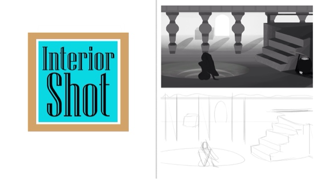
Developed Thumbnail of Interior for Final Concept
I came across a thumbnail that I really liked, so I have developed it to a point where I can star working over it for the final concept piece for Friday.
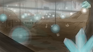
This is where the men of Anastasia work, while the women on the surface enjoy a life of luxury the men work in the mines, gathering gems and crystals, almost like slaves. I've tried to show this through he dismal conditions that the men work in, and the long lines of them you can see going about their work.
You can see the expanse of tunnels, dirt mounds, and caverns expanding onto the distance, where the mine car tracks run like vines through the canopy of a jungle along the roof off the cave, being held to the top rather than supported from the bottom. You can also see where the Miners have hung long ropes with lanterns off the rail tracks, to try and give themselves more light in the dark, now becoming almost haunting though in there hanging presence.
Saturday, 17 October 2015
Quick Colour Concept Mock Ups of Mines
Just got some quick concepts done of the entrance to the mines to show the transition from luxury to slavery.
More to come.
More to come.
Friday, 16 October 2015
CG Artists Toolbox: Animation, Zoetrope
In one of Megs early classes we made a small animation to use on a miniature Zoetrope that Meg had brought in. Unfortunately, at the time I had no device to film it on, but I got fellow class mate Kyle Mullings (http://kylesanimation.blogspot.co.uk) to record it on his device and email it to me.
So here is my first Zoetrope animation of the year, as you can hopefully tell it is of a hand scratching a record, a relevant choice wouldn't you agree ?
Thursday, 15 October 2015
CG Artists Toolbox: Digital Painting, Abstract Exercises and Structures.
Here we were testing the tools of Maya to see what different shapes and thumbnail Idea's we could come up with, Using the Brush Tool, and the Lasso Tool, to see what small art pieces we could make with them.
Brush
Lasso
Jordan also had as make different Renders of structures in Photoshop, so that once we could also use these in the production of thumbnails, he taught us this so that we can use this method as a quick way to produce urban thumbnails quickly.
CG Artists Toolbox: Digital Painting, Master Studies.
Here are my completed Master Studies, Jordan told me that while my first attempt at the top of the page is good, I took too much time going into little details, so I tried to simplify them from that point, to just capture more of the general information than precise details.
CG Artist Toolbox: Maya, Laser Blaster
I completed the model for my Blaster in Maya, I'm having some troubles with it smoothing but I believe that may just be the PC, when I can smooth it properly I will upload those models too. But for now the Model and Rendering is complete.
Wednesday, 14 October 2015
Life Drawing: Week 2
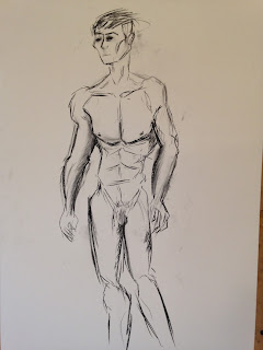
Today we had a live model, I tried to capture his form and muscle tone through simplistic lines and an attempt at cubism as-well.
Cubism Piece
2 Minute Poses
30 Second Poses (ran out of room very early)
Two poses I think came out particularly well
10 minute study Part .1
Part .2
I find music help's me keep fluid and motivated in class, and produce strong strokes and form. Today I think the song that I had the most success drawing to was:
Subscribe to:
Comments (Atom)
-
Here are my final concept designs for the centre piece building of my final piece, please chose which ever one (or more than one) you like t...
-
This term we took part in a clay sculpting work shop that was lead by Alan, I was unsure what to think about this as I had no prior experie...
-
Before I finish the final design and Orthograph's I wanted to nail down what Nigel's head fin looks like. So below I've made so...


