Tuesday, 29 December 2015

Star Wars - iPad Pro Test - Storm Trooper Tribute


It's always so nice when your faith is restored in something you love, this time being the first promising part of a new Star Wars trilogy, when they announced Episode VII I was skeptical, but the hype slowly got to me, and I wasn't disappointing. I thought it was a very promising start to the new trilogy, if not relying off Episode IV nostalgia a little, I still enjoyed it very much.

I also very much like the New Order Storm Trooper design, I always liked storm troopers, they always got the short end of the stick in my opinion and never really get a purpose besides cannon fodder. That is why I greatly enjoyed the scene where the Trooper (dubbed TR-8R) engaged Finn in a CQC battle, and actually defeated the light-saber wielding protagonist before being gunned down, finally a trooper doing something badass, RIP you glorious bastard.

But also yeah I got an iPad Pro and Apple Pencil as a gift this Christmas, And have been playing around with its artistic functions and testing what will work best for my creative need's, I am very much enjoying it so far and looking forward to the increase in production it will help me achieve. As a quick test of its replication of pencil sketching, I decided to life draw a Trooper's helmet from a figure my brother received (which I may have stolen). 

Thursday, 10 December 2015

What If Metropolis - Final Crit Presentation

Final Crit WIM by BradKompany

What if Metropolis - Final Scene Completed


Here is my final scene, complete with textures, lighting, and matte painting.


What If Metropolis - Matte Painting and Inspiration


My matte painting as seen above for my final piece background. It is inspired by one of the only example of a cityscape that Harper made, which can be seen below.


The three building designs are actually based off early thumbnails of skyscrapers I made at the start of the project. So it was nice to reuse these assets.

What If Metropolis - Textured Scene

Everything in place and textured ! Now just to adjust the position and intensity of the light source until im happy with the outcome, and then apply the Matte background and render.

What If Metropolis - Final Lighting and Render

(Fig. 1)

Here's my complete set composition, rendered from my final shot camera. I am VERY happy with how this has come out thus far, I have also configured my lighting for the final piece too as you can see in the above image (Fig.1)

Now all that remains is too apply my textures, I have also included a shot of my set before I had finalized the set pieces locations and lighting (Fig. 2)

(Fig. 2)


Wednesday, 9 December 2015

What If Metropolis - Final Set Assembled with UV Pre-Textures

Final Assembled Set ! Veeery happy with how this came together, looks so similar to my concept arts composition, all seems to come together so well.
Removed the floor so you can see the models clearer.
Note. The car has been reversed from the original concept piece, because I enjoyed the way the front looked more than the back and thought it would be a shame to hide it.

What If Metropolis - Final Car Model !

Now this ! took me longer than nearly all of my other models combined, it took me so long to get the curves looking right, the angles looking sharp, and generally capturing essence that this could actually be a real car, I think after much work I finally managed it, although trying to UV this thing literally made me want to commit Seppuku.
Happy with the end result though, look forward to getting better at modelling vehicles and eventually building more technical designs in much higher quality.

What If Metropolis - Fence Model and UV

Abstract Fence Design. Was a BASTARD to UV.
End result.

What If Metropolis - Final Tree Model and UV

Design for the tree on the lawn of the background house.
UV version, design.
I designed the top so that it had a cross section so that I could make the final texture have the branches that run up to the edge appear, while still having it be 3D.

What If Metropolis - Street Light Final Model and UV

Nice simple Street Light design, minimal branch like design, but with some nice details. 
Maintenance door with lock on the front of the lamp.
UV Mapped Version.

What if Metropolis - Red House Final Model and UV

Red Background House, less detailed then the main Blue one in the foreground.
Uv looking good !


What If Metropolis - Final House Model and UV

Finished Model with all details and ready to texture.
Uv Map good to go !

What If Metropolis: Film Review, The Shining (1980)


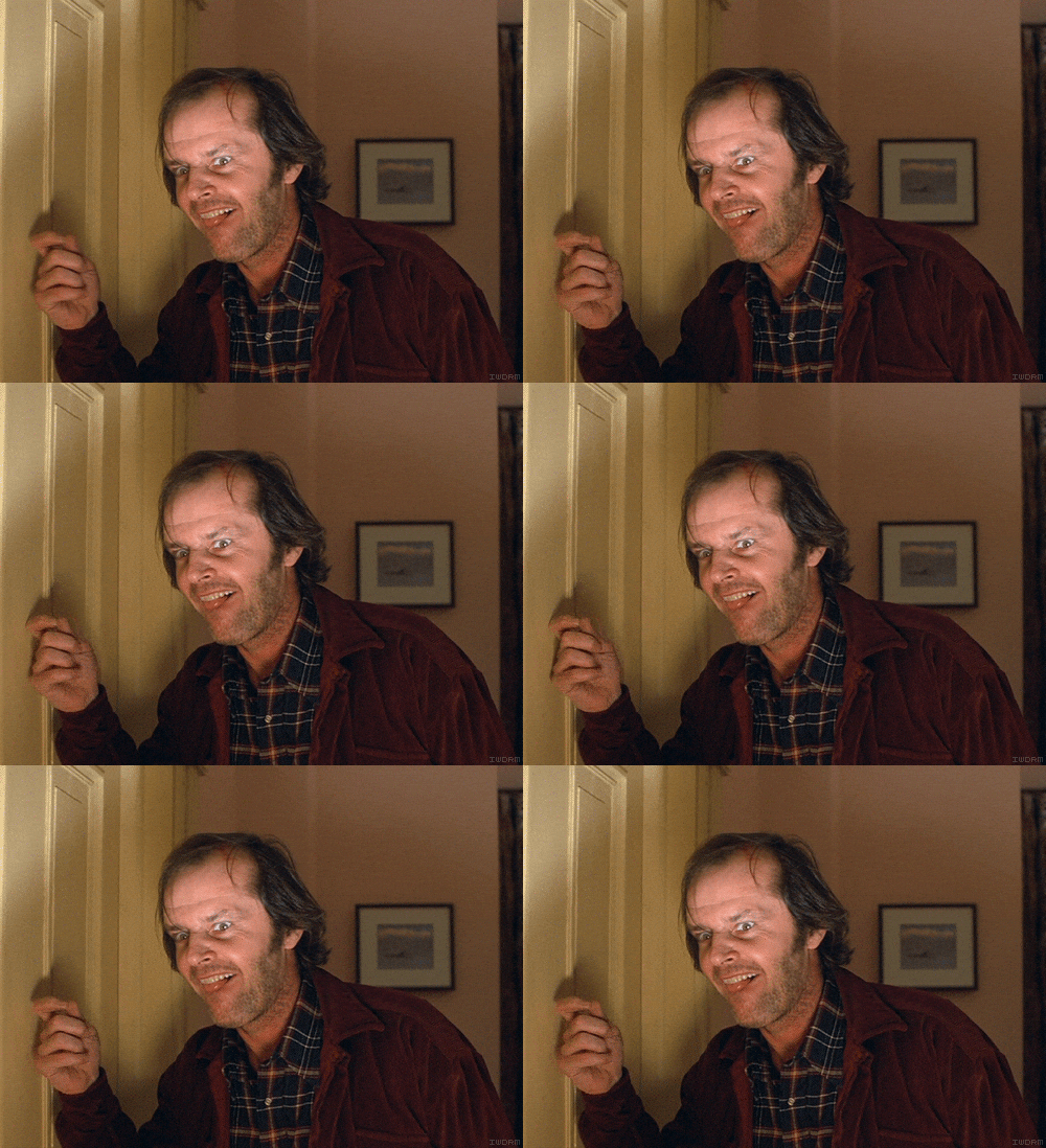
The Shining (1980)

Fig. 1

The Shining (1980) is another masterpiece by famed Stanley Kubrick, this film can technically be classed as an 80s horror movie, but when you use that term you normally relate it to lame special effects and a cheese story. But this film cannot fall into that genre type, tis film is another visual work of art from Kubrick, a film made iconic for its set design, constant looming presence, and slow tense plot that really never goes anywhere until the last act of the film.

The film revolves around a man named Jack (played by Jack Nicholson funnily enough) and his family, who are staying in a hotel in a isolated mountain range while Jack is working there as a sort of caretaker during the winter months. Jacks family consists off his son Danny and his wife Wendy. The owner of the hotel warns Jack of his concerns for his mental health during his job application interview, this is due to the isolation that comes with it, and a previous incident with the last caretaker, who ended up murdering his whole family then killing himself, Jack re-assures him its fine.

When they move into the hotel we are given a brief explanation of a super natural element that seems to be a happening in their universe, when we find out that Danny is actually someone who is susceptible from this mysterious "Shining". We find this out from a worker at the hotel who also is a user of the Shining. Danny has a strange habit of talking to himself in another voice while doing a sort of finger puppet gesture to a being named Tony, at first we think he is merely an imaginary friend but from this point we find out he is an actual entity (and if you've read the books you'd know that "Tony" is actually Danny from 10 years into the future). But there also seems to be a conflicting evil presence in the hotel, that slowly starts to effect Jack. "Danny begins to see visions of the past and future.....Meanwhile Jack begins to lose his mind as evil spirits corrupt him and he begins a violence-filled rampage throughout the hallways of the hotel." (Patrick, S.D).

Fig.2

The cinematography and set design is a main highlight though as this story slowly becomes a psychological supernatural horror, we are constantly presented with long following shots on a steady cam down winding hallways, as if we are actually pressuring the character. And there are some very little details in the design of the hotel that say a lot, like the strange patterned carpeted floors that while Danny is playing on, almost look like a prison or a maze (foreshadowing ?) "Like an unseen predator, Kubrick's camera prowls behind Danny, sometimes uncomfortably, claustrophobically close, as Danny's Big Wheel crosses hardwood and carpeted floors." (Valentin, 2005).

Fig.3

As Jack's sanity is rapidly crumbling when the supernatural events are at an all time high, the final confrontation of the film takes place where Jack finally looses it and the ghostly hotel spirits convince him he needs to murder his family, or else there would be some kind of un said consequence. After failing to murder Wendy and Danny and freezing to death outside, we see a picture dated from decades ago, where Jack can be seen in the front row of people, almost as if the hotel has claimed his soul. But we are left to decide the outcome of these events for our own "..Three people descend into versions of madness or psychic terror, and we cannot depend on any of them for an objective view of what happens. It is this elusive open-endedness that makes Kubrick's film so strangely disturbing." (Ebert, 2006).

Bibliography:
Ebert, R At: http://www.rogerebert.com/reviews/great-movie-the-shining-1980

Patrick, T At: http://www.thatfilmguy.net/the-shining-1980/

Valentin, M At: http://www.efilmcritic.com/review.php?movie=1383

List of Illustrations:
Fig.1 : http://www.geeklegacy.com/wp-content/uploads/2013/02/the-shining-original.jpg

Fig.2 : https://media.giphy.com/media/k3ysanIoI6Yx2/giphy.gif

Fig.3 : http://www.popoptiq.com/mazing-stories-literally/


Thursday, 3 December 2015

Life drawing week 11


Final Fence Orthograph/Texture, Pavement Texture, Tree Orthograph


More attempts to improve the "Harper-ness" of my final design.

Fence Inspiration

Tree and Pavement Reference, Idea Developed with Jordan.


What if Metropolis: Film Review, Repulsion (1965)

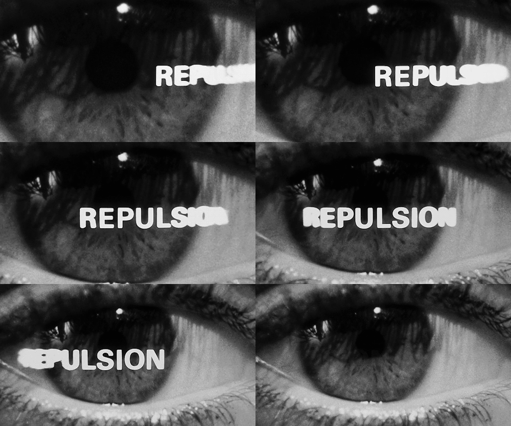
Repulsion (1965)

Fig.1

Repulsion (1965) is a surrealist horror film based on the sexual anxiety faced by a young Belgium woman named Carol who lives in Kensington London with her older sister Helen and works as a manicurist. This film was directed by the superb Roman Polanski, and is a film where he was clearly pushing the boundaries of what was acceptable to show in cinema in the early days of conveying some rather controversial scene's., in a time of which sexual freedom was at an all time high. "...Represents a unique place in the filmography of Roman Polanski...but in the 1965 it plays as an antidote to the prevailing attitude of exuberant sexual freedom, a horror film of sorts for the swinging 60's." (Bacchus, 2009).

The main plot revolves around a complex mental state that Carol seems to have developed where she seem's to be literally Repulsed by men, even to the point where it appears she is going be physically sick after an encounter with a young man. At first this doesn't seem to be a big problem in Carol's life style, considering she works in a salon that appears to be manned by an entirely female staff, lives with her sister, and besides a few chance encounters with random individuals while travelling between destinations, rarely ever comes in contact with any men at all.

That is, she heads home and we find out that her sister is in a relationship with an adulterous man who is currently married to another women (not helping her already established disgust of men) and after a scene where she actively avoids seeing him shave, and that night hears the couple's pleasured moans through the walls, we find out that they are going away to Italy together for a short while, leaving Carol in the apartment, on her own.

Fig.2

For the duration of this time alone, we bare witness as Carol goes through a mental breakdown. As she is exposed to a young man who has taken interest in her, and proceed's to pursue her romantically to her dis-appeal. Which proceed's to bring on to her a level of anxiety, which slowly develops to such a state over this time, to where she appears to hallucinate an encounter each night with a random man, who appears to manifest in her apartment each night while she sleeps, and then proceeds to sexually assault/rape her.

This proceed's to escalate as Carol's mental state rapidly declines, for the most part you are actually left to question whether these encounters are actually happening or not, there appears to be no physical way for it to be possible, but the end results and what we are shown seems to strongly imply this is happening, yet we are left with no possible evidence to the man being real or actually entering the building.  "Our first hint that we have entered a new world is when, along with her, we catch a glimpse of a man's figure in the mirror......Soon after, we are thrust into her (literal) dream and nightmares. And things grow increasingly worse from there, until the viewers struggle to tell whether what is happening to her is real or imaginary." (Smalley, 2011).

As her sanity shatters, we begin to witness progressively surreal sights taking place in the apartment, the most note worthy and iconic though. This being the scene's where we are shown her apartment morphing and changing around her. We are shown a hallway, which then grows multiple arms which from the walls, becoming a forest of non consensual touching, which proceed to grope her as she walks through. This shows her near constant worry of her own safety and purity, as she can no longer even feel safe in her home.

Fig.3

But to really seal the deal, a shot of the walls of her apparent growing large cracks and chasms through them, which appears to imply in a literal metaphor of her mental state literally breaking. The apartment at this point representing her own mind and the cracks representing her insanity and anxiety. A safe place becoming corrupted and wrong. "The Screenplay by Polanski and Gerard Brach is a model of intelligence, subtlety and the power of suggestion and understatement....it's a polished, startling-looking film thanks to Gilbert Taylor's fine, imaginative cinematography." (Winnert, 2013). 

Her madness eventually escalates to a level to where she murder's the man who is infatuated with her, who follows her home, forces her way into her apartment, and after confessing her feelings is killed by Carol with a hit to the head, hiding his body in the bathroom. The film concludes with the landlord finding the apartment in shambles, and after attempting to reassure Carol, he forces himself on to her and attempts to initiate intercourse, only for Carol to slash him to death with her sisters boyfriends razor blade from the beginning of the film (deus ex razor blade?)

Eventually her family and other apartment building residents discover the scene and escort Carol out the building, unaware the source of the slaughter was her. We are left with an ominous ending where we are shown a picture of Carols family in her youth, where she is seen scowling at her father, possibly implying some sort of incident or horrifying relationship may have occurred, which left her as she is now.

Bibliography:

Bacchus, At : http://www.dailyfilmdose.com/2009/08/repulsion.html

Smalley, G : http://366weirdmovies.com/repulsion-1965/ 

Winnert, D : http://derekwinnert.com/repulsion-classic-film-review-66/

List Of Illustrations:

Fig.1 : http://barbara-stanwyck.tumblr.com/post/133617280418/repulsion-1965

Fig.2 http://ianhendry.com/repulsion-1965/repulsion-1965-posters/

Fig.3 http://www.silenzio-in-sala.com/immagini_repulsione.html

Tuesday, 1 December 2015

What If Metropolis - Blue House, Final Texture's Sheet


After the feedback from my OGR about looking into the overall "Harper-ness" of my world, by thinking more about what the texture's would be of the world, instead of just plain block colour's. I have been working extensively of trying to find the perfect balance of art, that keeps in the original design scheme, without going too over the top. And after a final positive session with Jordan some final idea's were forged.

To begin, I made some custom Brushed in Photoshop, that would give a canvas effect to anything I painted, which was particularly helpful starting point considering nearly all of Harper's art has a similar texture.

For the main house, because I didn't want it to be too over designed, as large over complex designs seemed a bit much for a suburban lifestyle. So I looked into the work he mad eon fabric design's, and found a nice, simple, geometric design. I recreated the design's, and spaced them out a little more.

And for the (beak shaped) Garage, the small squares gave a minimal, yet tile like effect, that I thought fitted in, but still contrasted the other enough to stand out.